In my own opinion, a good advertisement doesn't just affect individuals but also connect everyone all around together. "We have to make things people want more than make people want things". From time to time we need to break the regulations if that leads up to wicked awesome advertisements.

1. Sensitive or stimulating words are rarely spotted in public display. This eyes-catching advertisement has proven us wrong and BREAKS THE RULES by posting "SEX" word.
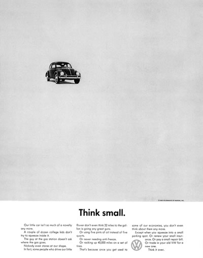

2. White space is commonly used in moderation, primarily as a tool to divide information. However these advertisements BREAK THE RULES and apply a considerable amount of empty space to publicize the products' simplicity.


3. It is often reminded that symmetric alignment should be avoided in a layout. Faber Castell's advertiser seems to think otherwise and BREAKS THE RULES. These outstanding layouts feel almost hyper-balanced with a line of symmetry running down the center of the piece.

4. Designers are taught to limit the color using in their design. But sometimes we must BREAK THE RULES to create captivating designs. The quantity of color should not be an issue as long as color is used effectively to emphasize importance, not just decorating the page.

5. "SALE" word painted in bright color and magnified until almost half of the advertisement has been occupied is a norm. But this advertisement BREAK THE RULES by having an unexpected twist planned for the customers.